War Breaks Things

I’ve been doing some reading on Second World War combat. It’s been interesting, since almost no one’s fought a war of comparable intensity since, and it’s raised some uncomfortable questions about how the U.S. has structured its military.

If you have an image in your head of The Great War, it’s probably of French countryside turned into a blasted moonscape, with waves of men charging futilely into machine gun fire. We associate WWI with a sort of grinding attrition, a fighting that was more meat grinder than contest of skill. We don’t, by and large, think of the Second World War in that light. We tend to think of tanks and planes and commando raids and huge armies moving across open country in a war of maneuver.

That’s not strictly the case of course. The Second World War could prove to be every bit the grinding war of attrition that the first was. The new weapons just made the fighting destructive enough that the combatants could, in fact, destroy the enemy faster than they could be replaced.

A new body of scholarship on the American army in WW2, characterized by Robert Rush’s Hell in Hurtgen Forest and Peter Mansoor’s The G.I. Offensive in Europe, has argued that American infantry divisions were superior in combat to their German counterparts. They attribute this to the fact that the American replacement and organizational system at the division and regimental level allowed them to continue fighting at a high degree of combat effectiveness in the face of truly staggering casualties. The 4th Infantry Division that Rush studies, for instance, suffered 531% casualties among its rifle companies, and the 22nd Regiment specifically suffered 580% casualties between June of ’44 and May of ’45. Perhaps more disconcertingly, Rush discovered that in the American unit he studied in the Hurtgenwald, casualties were not more common among new replacements. Death and injury struck veterans as readily as green troops. Getting killed was simply a function of time.

Modern combat destroyed minds as readily as bodies. In their influential study on combat exhaustion Roy Swank and Walter Marchand argued that mental collapse was a nearly inevitable byproduct of exposure to combat. Taking their data from American combat soldiers in Normandy, they discovered that 60 days continuous exposure to combat produced more than 98% psychiatric casualties — men who had been  reduced to either a catatonic state or a constant and crippling hyper alertness. The  less than 2% who were not subject to this mental degradation were almost entirely what Swank and Marchand called “aggressive psychopaths.”

The same process can be seen in the realm of materiel during the war. The Sherman tank was incontrovertibly  inferior to the Pz. V and Pz. VI tanks, but the Germans were never able to build enough of these to meet demand. The Sherman, on the other hand, was plentiful and easily replaced, and held a modest advantage over the far more common German Pz. III and Pz. IVs. Similarly, the Japanese held an advantage in fighter pilots and fighter aircraft at the beginning of the war, with the Mitsubishi Zero and the pilots of the Imperial Japanese Navy outclassing anything in the American arsenal. But as the war went on, the Japanese couldn’t replace their highly trained pilots quickly enough keep pace with their losses, and couldn’t develop a new fighter to  match increasingly sophisticated American aircraft.

Of course, very few armies seem to have taken these lessons into account. Rather than trying to develop a force structure that has a very high level of endurance, the American army has overwhelmingly turned to increasingly sophisticated training and equipment to produce a very high quality force. Given that almost all of the conflicts that the United States has fought in since 1965 have been low intensity wars with tenuous political support, this makes sense. The best training and equipment minimizes casualties against guerrillas or third rate armies, which keeps the number of American dead low, which in turn helps keep the American people on board.

Of course, we can also see the seams in this system. At the peak of the Second Iraq War in Oct. 2007, only 166,300 Americans were deployed there, with another 24,800 in Afghanistan. Thus, at its peak, the U.S. military had 191,100 personnel involved in its two most recent wars, with only 6,845 killed in those conflicts. This effort, which by the standards of the 20th century is a modest affair, pushed the American military to its breaking point. Manpower levels were maintained through a combination of stop loss and lowering recruitment standards, and there’s been some talk that the postwar military won’t be ready for another conflict for some time.

This all suggests to me that the U.S. military as currently structured is largely tailored to the kind of wars that it’s wanted to fight for the past fifty years — overseas conflicts of short duration against smaller armies, won through the skilled application of firepower. It’s clearly not equipped for either long, low intensity wars, or for wars fought at a 20th century level of intensity. Given that the United States has enjoyed what is at best marginal success in its long wars, and would likely be facing very intense combat in any scenario where it’s deployed against major power, I’m wondering if maybe we aren’t better off rethinking our force structure entirely.
Tagged , ,

HTML is the Devil, and Other Observations

Working on the design for my final project has been profoundly edifying. I’ve learned, for example, that I am still terrible at HTML.

HTML has rules that I simply don’t understand. How it decides to put things on the page, and what I have to do in what order, remains a mystery wrapped in an enigma wrapped in an all consuming rage. Some of the problems I’m having seems to be a product of the way that I like to approach building a page. I start by laying out my divs for each section of the page, so the entire layout is coded before I start filling in each piece. This allows me to conceptualize the whole page, and makes configuring the style sheet more straight forward. Unfortunately, it also does strange things if I don’t fill things in in the right order. I started fidgeting with the footer, and it was putting the rule I added above my navbar until I added content to the body section. I don’t know why. There’s clearly some way HTML decides to do page lay out that is consistent, but unknown. I’m also having one hell of a time getting things to fit in the appropriate amount of vertical space. Some of this may be a product of using 960 grid, which seems to like vertically aligned page design (something about columns) more that horizontal. So its going to take time, tinkering, and coffee to make it all work.

On the other hand, I’ve come to appreciate Photoshop more. As I tried to get the basic aesthetics of the lay out put together, I found that I was looking at images for the background with an eye to what I could do in Photoshop. Knowing that I could crop, enhance, recolor, or otherwise alter an image to suit the needs of the page was vastly more useful than I would have imagined before working with the program.

However, I’m still very much aware of the limitations of Photoshop for the kinds of projects I work on. I’m hoping to make my site a narrative walkthrough of the Dachau Liberation Reprisals, making use of the multimedia nature of web design to make the sequence and locations of events less confusing. But this means that most of the images I’m working with are not things I want to Photoshop, other than perhaps cropping them. I’m very, very hesitant to apply any sort of manipulations that might give ammunition to people who would contest the reality of either the nature of the camp at Dachau or the events of the reprisals.

I’m also having some issues with trying to come up with an overall aesthetic for the site. I’m trying to stretch my coding skills, and do something different than the sparse grey, black, and red palette I’ve used for my portfolio page, but I’ve come up against two issues. The first is that my coding skills don’t seem to be up to making things pretty. I’m at the point where I can make something functional without much difficulty, but I can’t necessarily get the page to do what I want, and I’m still a long way from something that looks good. The second issue is that I’m not use some of the aesthetic guidance we’ve received is going to be much of an aid in a project like mine. My photos are all black an white, so they aren’t any help for picking a color palette, and I don’t know that picking a specifically 1940’s looking font is going to be appropriate for the material I’m dealing with.

I think my design is going to need to get away from looking like it has a direct connection to the historical period I’m working with. Explicitly old timey looking design is, at best going to look kitschy, and at worst disrespectful of the subject matter. Instead I think I’m going to go with an aesthetic that’s more museum: clean, sparse, and as professional looking as I can make it. Which likely will wind up being not very.

Image Assignment

My image project is now online here.

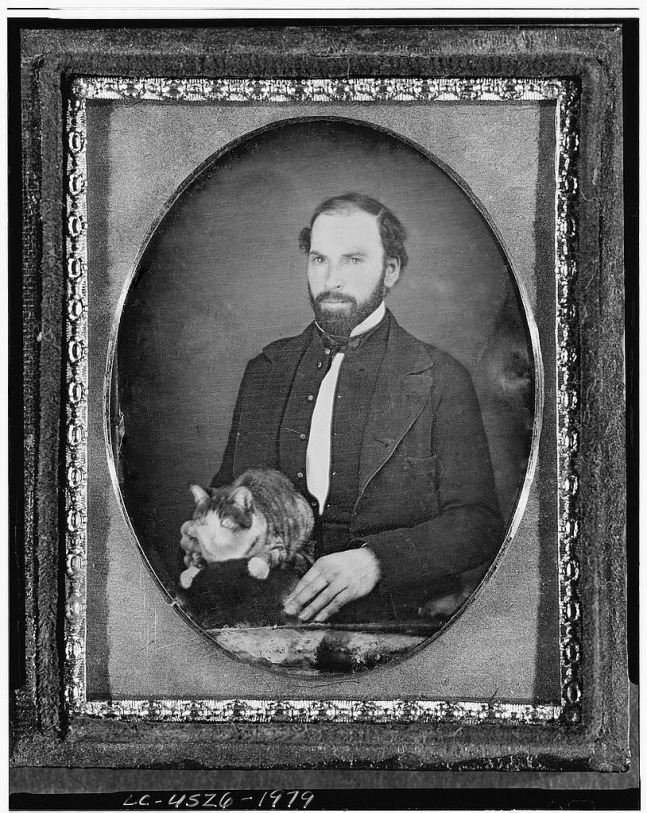
Cat Man Image

Cat and Man Edit

Because people seem to be putting up their cat man image, I’ve included mine here.

Altering Images

ImageSince we’ve been doing mostly technical stuff lately, and I don’t have any exciting Photoshop stories to share, I thought I’d riff for a bit on the role of photographs in history, and particularly the question of how we interpret the meaning of photographs.

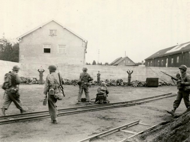
So what’s the photograph I have above? Well, in the foreground, we have men in American Army uniforms, circa 1945, and in the background men in German uniforms, many of whom appear to be dead. Taken at Dachau during the liberation, the photo is most likely taken after Lt. Walsh issued orders (the extent and clarity of which is ambiguous) that resulted in the deaths of at least 17 German POWs. Even knowing the context, I find the photograph perplexing. Why are the three Germans still standing? Did they not dive for cover when the shooting started? Is the guy in the middle with his arms crossed defiant, or simply tired? How long after the shooting took place was the photo taken? While it’s difficult to see at the resolution you have here, a number of the Germans on the ground aren’t dead, and are in fact looking back towards the line of Americans. Why are they still lying in the pile of bodies? Are they wounded? Is the photo taken too soon after the shooting for them to have gotten up?

Most interesting, to me, anyway, is why was this picture taken? Because it looks, quite clearly, like a massacre. So why did an American (and the person behind the camera almost certainly has to be American) take a picture of an American war crime? This isn’t unheard of, of course. Soldiers often take pictures of the carnage they witness, or inflict, and German soldiers certainly took plenty of photographs of their own crimes. It seems to be almost a form of souvenir taking. A way of saying “I was here, I saw the worst of war, and I can prove it.”

So what does this tell us about photographs for the purpose of history? I think it speaks to the sensitivity of photographs to change. I encourage you to look up the full size image of this picture (there’s a 5000×4000 version online if you search for Dachau Massacre) because its striking how just shrinking down the image reduces its complexity. The German dead in the small one look like a solid mass of dead, whereas in the full size you can see that a number of people are still clearly alive, if perhaps wounded. It complicates the image, making the violence look less thorough, more haphazard. It’s more ambiguous. You don’t notice the German on the far right, behind the American with the BAR, as much, and it isn’t as prominent that he’s standing past the edge of the pile of dead and wounded. It’s an extreme effect of a small change, and from a change that you wouldn’t think would make much of a difference. I think it encourages a certain degree of caution when “touching up” old images, since the emotional resonance, the meaning, of an image can be drastically altered by seemingly inconsequential things.

The Use of Photoshop for Historians

So this one is a little late because I was on a transcontinental flight all yesterday, and in the middle of nowhere for the week or so before that. So I’ve been trying to get up to speed on Photoshop, which is perhaps the least intuitive program I’ve used in a very, very long time. And in futzing with it, I have to admit I’m not entirely sure how useful Photoshop is as a tool for scholars. For web designers certainly, but I worry some about its use for history. After all, Photoshop is a tool designed to allow you to manipulate images, and manipulating images is something that we should probably be leery about as historians. Images can make arguments, and between the temptation for a compelling complement to our written work and the desire for pretty pictures, I don’t know that image manipulation is a tool we’re going to be able to use for good. Having seen competent people work Photoshop, I know that even fairly minor changes like cropping, contrast, or adjusting shadows can result in a dramatically different picture than the one taken, and the temptation to remove inconvenient elements can be overwhelming. For instance, the famous photo from the Kent State shootings had a stake removed from behind the woman’s head. Its true that removing this particular element probably doesn’t undermine the accuracy of the photograph, generally speaking, but we start getting into a slippery slope question about what we’re willing to change for a good shot. On the other hand, learning about the how’s and why’s of photo manipulation may well be useful in examining historical images. Understanding what can be manipulated in a photograph, and some of the basic tricks used (say focusing on a small section of the crowd at a rally to hide low attendance, or manipulating color to make wet dirt suggest blood) may make us cannier historians. Most Photoshopping, and certainly older, manual forms of photo manipulation, leaves some trace if you know what to look for. It also may simply encourage us to be more skeptical and attentive to the photographs we make use of. I suppose I’ll have to see where greater familiarity with Photoshop leads me.

Design and Pedagogy

This week’s reading got me thinking about the extent to which design can be taught. While there were a number of practical suggestions in the chapter from White Space is Not Your Enemy, most of what the author suggested can be summed up as “don’t use colors that don’t look good together,” which is good, if not terribly useful advice. Part of the problem of course is that design relies on a well developed aesthetic sensibility. Sure red and green are complementary colors, but are the particular shades you’ve chosen? Does it make your website look like a bad Christmas card? Which elements should be which colors? If green is your dominant color, how much red is too red? And the answer to all of that is, it depends. It depends on what looks good, what looks right. And if you can’t see what isn’t working when you look at your website, you’re out of luck. 

As a case in point, take my type assignment from last week. The most common (and I’m sure correct) criticism that it received was that the line spacing was too tight. People felt that the text looked cluttered and smashed together. Which is fair. But when I was putting it together, I spent a fair bit of time fidgeting with line spacing. I had let the spacing out some, because Georgia is a fairly heavy font, and then pulled it back in a bit when it started looking like it was losing cohesion. So in the end, what I thought was an appropriate line spacing was actually too tight for most people to read comfortably. The problem of course is that I’m not sure I could have been taught to make that decision correctly the first time.

As such, I’d suggest that teaching design, like teaching writing or any craft, is a matter less of direct instruction than constructive critique. Other than a few very broad and general principles to act as basic guidelines (use lots of space, no Times New Roman) the best method of learning seems to be to make as many mistakes as you can as quickly as possible. The critique is where learning takes place, and where one’s aesthetic sense can be developed. Because even if I won’t ever necessarily be able to see the problems with my design work intuitively, I can start storing away lessons about the way in which my sensibility doesn’t work for other people, which will hopefully let me make positive adjustments in future.


Aesthetic Imbecility

Design is my Achilles heel. This week’s project dealing with type has reminded me that my aesthetic sense is profoundly weak, and that I have a very difficult time placing elements on the page in a visually pleasing manner, and I can only imagine that my choice of fonts is questionable to atrocious. But perhaps some value can be had in dissecting the corps. I chose to continue with my general grey/black design scheme, since the images that I have to work with are almost entirely in greyscale. To add some color, I think I’m going to try to add a deep to moderate red as the link color, which should fit with the scheme and not be too intrusive. I’m always hesitant to get too fancy with colors, because I don’t have a great sense for what works together.

I decided to continue with the typed document theme, and am still using the Remington Noiseless Google font for headings and titles. I attempted to find another typewriter font that would be readable enough for the body text, but this was fairly difficult. Another Google font, Nixie, was reminiscent of a typewriter font, while being light enough that I thought it might still be legible in the body, but when it was used on a full page of text the lightness of those lines turned into an unreadable web of spidery lines. Still, this wasn’t a total waste, as I used Nixie for the pull quote, where the larger font size and relative small quantity of text allowed it to serve as something eye catching, while offering a halfway point in legibility between Remington and a more traditional font choice.

For the body font, I tried a number of different choices besides Nixie, none of which I was terribly pleased with. I wound up staying with Georgia. I chose to stick with this for a few reasons. The first is that its a serif font that still looks good on a screen, and I tend to deeply dislike sans serif fonts. Georgia also offers very prominent ascenders and descenders, which I find helps readability a good bit. The ascenders are most prominent on capital letters, which emphasizes the beginnings of sentences, paragraphs, and names, which is useful. It also has very prominent descenders on numbers, which means that dates really pop out of the text, something helpful when writing about history. I find that this combination helped keep me oriented in the text in a way that other fonts simply weren’t able to manage. Georgia doesn’t do much to add to the historical feel of the site, but with Remington and Nixie to provide that, I don’t feel Georgia much detracts either.

Also, I want to say that using a 960 Grid CSS sheet to help with layout was a godsend. For whatever reason, I have a very difficult time thinking in pixels when it comes to laying out divs, and the 960 grid layout allows me to block out changes to my site in my head, which speed things up tremendously. I was able, when integrating the pull quote, to reconceptualize the layout of the site to include a right sidebar and then actually implement the code in less than five minutes. It was an incredible change from the hours I spent fiddling with layout for the home page.

Finally, images continue to be an endless design sinkhole for me. Finding appropriate images, deciding on size, placement, cropping, and interaction with other elements is terribly fidgety, and I often feel like a poor investment of time. I’ve been tempted to conclude that images are simply not worth the effort, but I think it may be my own limitations as a designer, as others seem to manage with them alright.

Cryptic Code

So I coded a website. It’s not, you know, good, or anything, but its has ten fingers and ten toes and opens when you click on the link. Which is an accomplishment, having known basically no HTML last weekend. And between bouts of incoherent rage while trying to get the code to do what I wanted it to, I thought some about how to teach historian’s computing skills. It was immediately clear to me that the only way to learn anything about digital methods is to use them. All of the little things we’ve learned, <p>, building wrappers, style sheets, was floating nonsense until I had to actually use it do something. I’ve spent a fair bit of time talking about topic modeling and its implications for history, because that’s what we were assigned to do. But after trying to wrestle with HTML, I’m confident that I have no basis on which to form an opinion on something like topic modeling until I’ve spent a lot more time with MALLET. As such, I think I’m on board with the idea that to be a digital humanist, you have to be able to code. You have to do to understand how something like this works, and if you don’t understand how it works, you don’t understand its possibilities. That said, I’m also less sanguine that digital history is going to ever be more than a niche discipline, precisely because of how much you have to get your hands dirty with computers to “do” digital, and to understand it. There have certainly been branches of historical inquiry that depend on cross disciplinary skills, economic history, the old social history, anything quantitatively driven, but these have tended to come and go as the people interested in both the mathematics and the history have become scarcer. In the same way, I don’t see an army of historians emerging with a real interest in devoting the hundreds of hours necessary to learn to code, or interpret text analysis, or fidget with ARCGIS. More and more history will have an online presence, or a digital presentation, I’m sure, but I’d be surprised if this was a factor of more historians trained in digital technique instead of the proliferation of things like WordPress and other no-code workarounds. So we’ll see a change in presentation, more than a change in method. What the implications of this will be for the discipline remain to be seen.

Lines in the Sand

Like most academics, I have a hard time stepping away from a good argument about definitions. So I enjoyed Stephen Ramsay’s piece “Who’s In, Who’s Out?” on who does and doesn’t count as a digital humanist. It seems to me that the major split in the digital humanities is between those who use digital methods primarily for research, and those who use them for primarily for presentation. While there is certainly overlap between the two, especially when maps come into the picture, I think there’s something fundamentally different about using digital methods to generate new knowledge. Presenting information in a digital or online environment is increasingly common, and at some point, I think it’s going to be unremarkable to see scholarly projects with their own websites. Increasingly, using the term digital humanist to describe this sort of activity is going to be superfluous. What I think will remain niche is this integration of digital methods into scholarship. While there are real advantages to using GIS or MALLET or any of the other fancy new tools and techniques, I have a hard time seeing them becoming universal. The old way of doing history, or literary criticism or what have you, i.e. reading a lot of books and then writing down your thoughts about them, is unlikely to be totally replaced. Those who continue to do things in that manner will remain methodologically distinct from the text mining types, even when they all have websites for their work (and themselves). So if I had to put money on it, I’d say that this is where the enduring distinction is going to be drawn. How you generate your scholarship is ultimately a more divisive issue than how you present it.